Curtain colour is one of those decisions that sound very straightforward until you find yourself in a fabric store or scrolling through hundreds of online options only to suddenly be in doubt of the actual colour of your living room walls – are they cream or warm white – and depending on the answer, is sage green then a good idea or a complete disaster?
The wrong curtain colour does not just look a bit off — it changes the entire mood of the room. Too cold and the space feels clinical. Too dark and it closes in. Too similar to the walls and the curtains disappear entirely. Too contrasting and they become the only thing you notice when you walk in.
This guide simply dispels hesitations! Here is what we are about to uncover: the colours that will be brilliantly working in living rooms in 2026, how to match these colours with your current walls and furniture, and the colour combinations that interior designers keep choosing — because they are the ones that work well.
The Golden Rule of Curtain Colour: The 60-30-10 Principle
Before getting into specific colours, it helps to understand one principle that professional interior designers use constantly: the 60-30-10 rule. The idea is that a well-balanced room uses three colours — 60 percent of one dominant colour (usually walls and large furniture), 30 percent of a secondary colour (smaller furniture, rugs, window treatments), and 10 percent of an accent colour (cushions, artwork, accessories).
Curtains usually would be placed in the 30% category – sufficient to influence the ambience of the room but not so loud as to compete with the walls. The 60% color you have is your base, and the curtain color should either harmonize with it warmly, stand out to it boldly, or simply be neutral next to it.
Given the framework, here is a list of the curtain colours that are globally the best sellers for living rooms at the current time – and also tips on how to put each one to use.
✦ PRO TIP: If you genuinely cannot decide between two curtain colours, order fabric samples rather than relying on screen colours. Fabric looks completely different on a monitor versus in real life under your home’s specific light conditions.
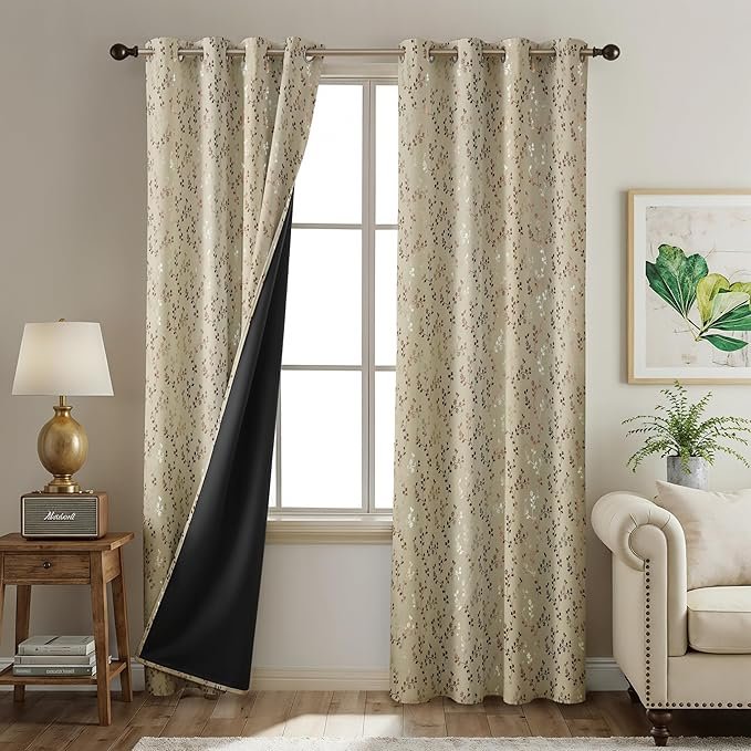
1. Forest Green — The Colour That Works in Almost Every Living Room
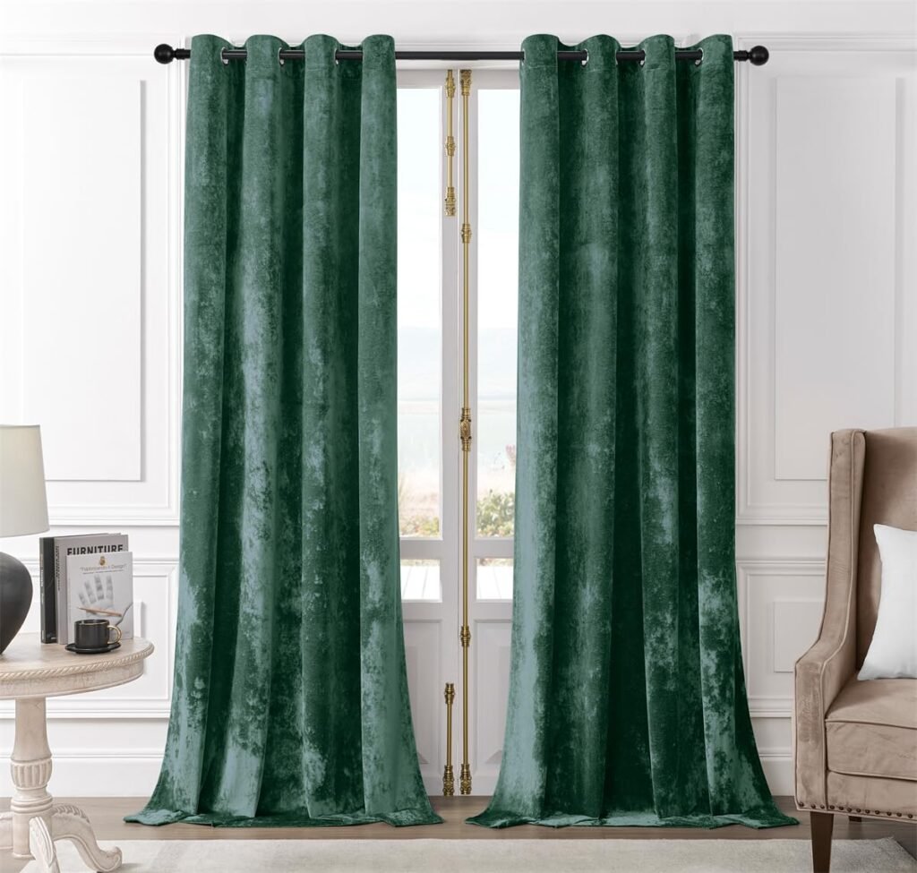
Forest green has become the definitive living room curtain colour of the mid-2020s, and there is a very good reason for that. It is warm without being heavy, rich without being aggressive, and it works against an extraordinarily wide range of wall colours — cream, warm white, terracotta, pale grey, blush, even other greens in different tones.
Forest green velvet is really a beautiful colour — it has the richness and warmth of a jewel tone without the intensity that makes some people uncomfortable with bold colours. However, when forest green is done in linen or cotton, it looks gentler, more laid-back, and can be used in a wider range of interior styles.
What walls does forest green work with?
- Cream and warm white walls — the classic combination. The green reads as rich and deliberate against clean white, and the warmth of cream prevents the combination from feeling cold.
- Terracotta and warm ochre walls — an earthy, maximalist combination that feels very current. Both colours come from nature and sit together naturally.
- Warm grey walls — green against warm grey creates a sophisticated, slightly Scandi feel that suits pared-back modern interiors.
- Pale blush or dusty pink walls — surprisingly effective. Green and pink are complementary colours on the colour wheel, and in their muted versions they create a quiet, sophisticated palette.
What to avoid with forest green curtains
- Cold bright white walls — the combination can feel stark and slightly clinical rather than warm
- Blue-grey walls — green and blue-grey can clash subtly in a way that is difficult to identify but feels uncomfortable
2. Navy Blue — Timeless, Sophisticated, Never Wrong
Navy blue is the curtain colour equivalent of a well-cut navy blazer – it matches with nearly everything, it makes whatever it is paired with look better, and you can never mistake it for a wrong choice. In living rooms, navy curtains create a feeling of depth and gravity and this is not in any way oppressive. They are equally at home in traditional, contemporary, and transitional interiors.
Navy velvet is a great choice for a richly dramatic look which is especially good for the evening and the rooms with warm artificial lighting — the shade really deepens under warm light. Navy linen or heavy cotton are a bit more casual and therefore suitable for the beach house type of interiors, nautical theme, or relaxed modern living rooms.
What walls does navy work with?
- White and off-white walls — the classic combination. Clean, sharp, and very flattering to almost anyone. Navy and white together is one of those color pairings that appear intentional and thought through even without a designer’s
- Warm cream walls — adds more warmth than white. The combination feels slightly more traditional and cosy.
- Pale grey walls — navy against grey can look very contemporary and sophisticated, particularly in rooms with chrome or brushed steel fixtures.
- Sage green walls — an unexpected combination that works beautifully. Both are cool-leaning colours that feel calm and quiet together.
What to pair with navy curtains in the living room
Navy curtains pair perfectly with warm-colored furnishings like natural wood, camel leather, or warm linen sofas. They are not suitable for cold greys and steel. Cushions in dusty pink, mustard, terracotta, or warm white can be used to complement navy and will deeply warm the mix. A jute or wool rug grounds the floor with the curtains without doubling up on the navy color.
3. Warm Terracotta and Rust — The Colour Making the Biggest Impact in 2026
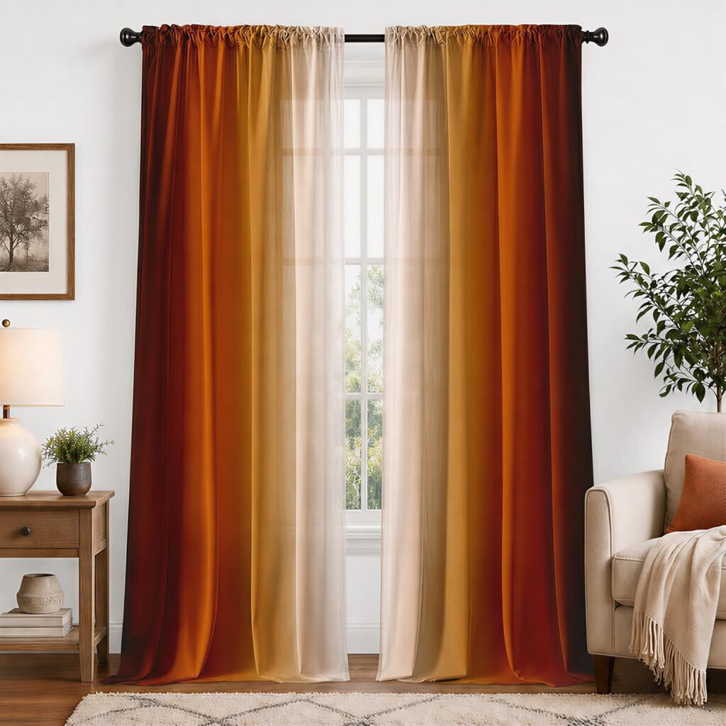
Warm Terracotta and Rust Curtains
Terracotta and rust shades have evolved from mere trends to become truly mainstream over the past few years. In fact, in 2026, they are still among the most powerful and pleasing curtain colour options for living rooms. These colours are warm, earthy, and have a humanising effect – completely different from the cold greys and sterile whites that were the staples of interior design ten years ago.
Terracotta curtains work best for those areas that aren’t blessed with a lot of natural light – like the north-facing rooms in the UK, or the ones that have only tiny windows. The colour’s warmth somehow balances the shortage of daylight, unlike the cool colours.
What walls does terracotta work with?
- Warm white and cream walls — the most accessible combination. The warmth of the curtain picks up the warmth in the wall without competing.
- Warm grey walls — terracotta against warm grey creates a sophisticated, earthy combination that feels both contemporary and comfortable.
- Sage green or olive walls — an earthy, natural palette that feels grounded and organic. Both colours come from nature and sit together without effort.
- Pale yellow or ochre walls — a warm, maximalist combination that needs confident handling but looks genuinely striking when done well.
⚠ WATCH OUT: Terracotta curtains in a room with cold, blue-toned grey walls or stark white walls can look jarring. The curtain needs warmth in the walls to connect with. If your walls are cool-toned, choose a slightly more muted, pinker terracotta rather than a pure orange-brown version.
4. Dusty Pink and Blush — Soft, Sophisticated, Works Beyond the Bedroom
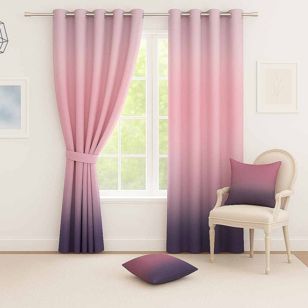
Dusty pink curtains or blush shade are not only reserved for a feminine or delicately soft room anymore. In fact, they have turned into one of the most multifunctional and chic color choices for modern living rooms. The keyword here is dusty – not a bright pink, nor a lively pink, nor a shocking pink. The pale, slightly greyish pinks that are almost pink and almost nude are the perfect fit for living room decoration.
In velvet, dusty pink has a quiet luxury that photographs beautifully and feels unexpectedly grown-up. In linen, it is soft and natural. In either fabric, paired with the right wall colour, it creates a living room that feels both interesting and restful.
What walls does dusty pink work with?
- White walls — clean and simple. The pink reads clearly and adds warmth without the room feeling overly colourful.
- Warm cream or ivory walls — adds more warmth and softness. A very gentle, welcoming combination.
- Sage green or forest green walls — this is the combination that surprises people. Green and pink are complementary colours, and in their muted, desaturated versions they create a palette that feels sophisticated rather than sweet.
- Grey walls — dusty pink against warm grey softens the grey considerably and prevents it from feeling cold.
✦ PRO TIP: If you are nervous about pink in a living room, start with one pair of dusty pink panels at a window rather than committing to every window in the room. Often, one curtained window in this colour is enough to understand whether it works for your space.
5. Warm Neutral — Natural Linen, Oatmeal, and Warm Cream
Neutral curtains are not a second choice or a lack of creativity – they are actually a conscious design selection that endows a room with adaptability, eternal nature, and a serene, anchored character that bright colors may not always be able to deliver. The secret lies in opting for warm neutrals over cold: natural linen, oatmeal, warm cream, and biscuit are the colors to go for. Very white and cool grey neutrals in curtains may appear dull and somewhat like in a hospital.
Warm neutral curtains can be a good choice for every living room as they don’t vie for attention among other elements in the space. Besides making your furniture and artwork more attractive, curtains are also capable of adding accessories a nice touch. What if the window in the room captures a gorgeous view of a garden, an architecturally interesting street, or a landscape – then, neutral curtains would be able to decorate the view without overshadowing it.
When neutral curtains are the right choice
- Open-plan living spaces where consistency across multiple windows matters more than individual impact
- Rooms with a lot of pattern elsewhere — bold wallpaper, patterned sofas, statement rugs — where curtains need to step back
- Rented properties where flexibility and re-sale appeal matter
- Rooms with genuinely beautiful natural light that you want to preserve and not absorb
- Minimalist interiors where the goal is simplicity and clean lines
6. Charcoal and Dark Grey — Bold Without Being Dramatic
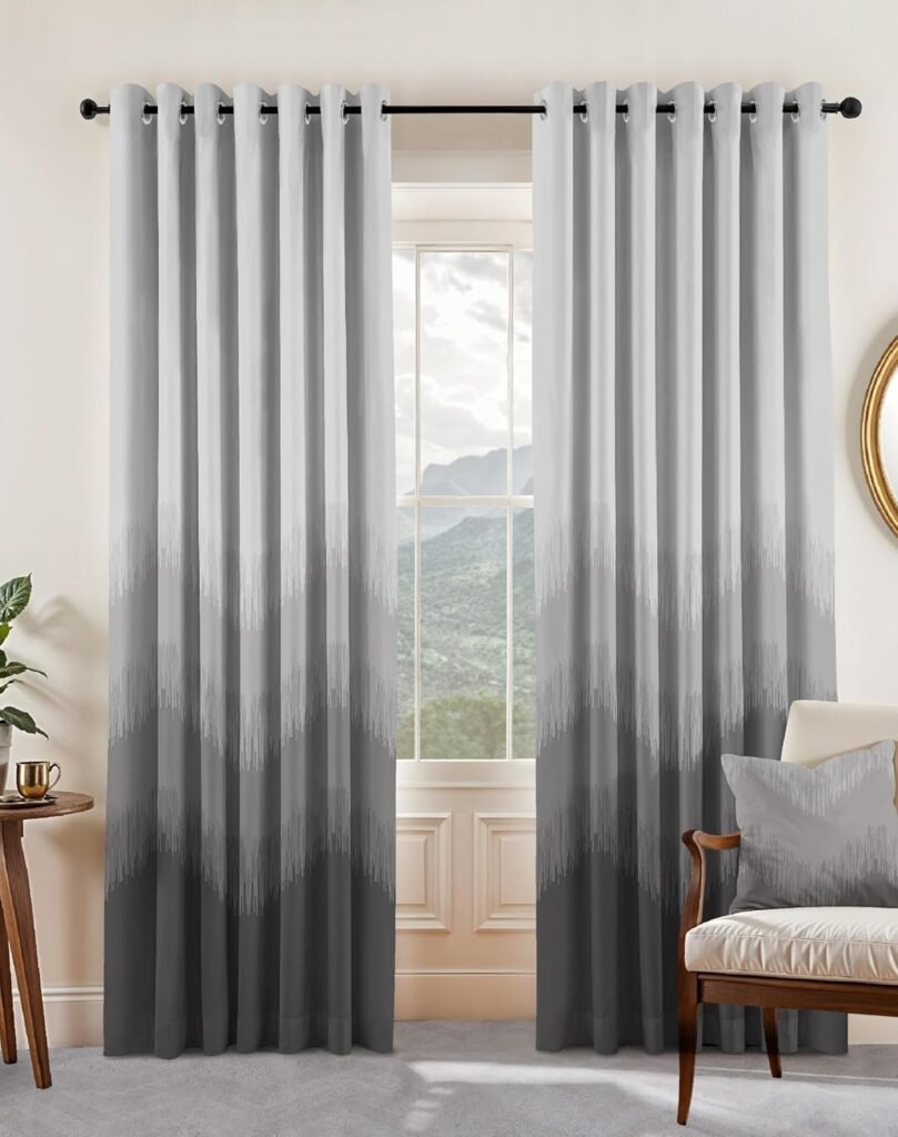
Charcoal and Dark Grey Curtains
Charcoal curtains are really trending in living rooms – and the reason is quite obvious. They are a shade deeper and more intriguing than mid-grey, yet not as bold as black. They provide a feeling of enclosure and closeness that light colours fail to offer, hence, in the evening, a living room with such curtains feels not only warm but also well thought out.
Charcoal can add an anchor to a large living room, helping to balance the expansiveness of the space. However, in small rooms, charcoal must be used very sparingly as it tends to shrink spaces visually. If the purpose of the room is to be a warm and intimate space, then the feeling of smallness that comes with charcoal might not be a problem at all.
What walls does charcoal work with?
- White walls — the contrast is high but works well in modern, minimalist interiors with clean lines
- Warm cream walls — the contrast softens and the combination feels more traditional and comfortable
- Pale greens and sage — charcoal against sage green is a particularly effective contemporary combination
- Terracotta and warm rust walls — unexpected but genuinely beautiful. The warmth of the wall prevents the charcoal from feeling cold.
📌 NOTE: Charcoal and dark grey curtains will reveal dust and lint more clearly than light colours. If you have pets in your home and/or if the rooms are very busy and getting a lot of daily use, then you can expect more regular maintenance for the dark curtains to be kept clean and looking at their best.
7. Sage Green and Olive — Nature’s Neutrals
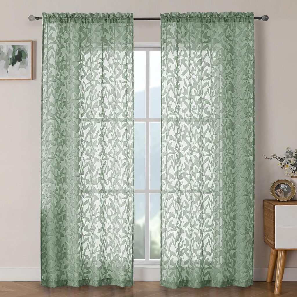
Sage green and olive hold a curious spot in the spectrum: these are not neutrals, but neither are they vibrant for a fact. In a way, they serve the purpose of neutrals by being compatible with almost any other colors — however, they add a distinctive touch that pure neutrals are not able to, a connection to nature, serenity, and a cozy warmth.
These colors fit well with the biophilic design trend that has been gaining momentum throughout the 2020s – bringing natural colors, materials, and references into the home. Sage green curtains especially photograph very well and are regularly featured among the most repinned curtain images on Pinterest.
What walls does sage green work with?
- White walls — clean and fresh. The sage reads clearly and adds exactly the right amount of colour.
- Warm cream walls — slightly warmer than white, creating a more comfortable and less graphic feel
- Pale pink or blush walls — the green-pink complementary combination that keeps appearing in the most beautifully designed rooms
- Off-white with warm undertones — creates a room that feels like it belongs in a Nordic farmhouse, which is a very appealing aesthetic right now
8. Mustard and Ochre — For the Confident Decorator
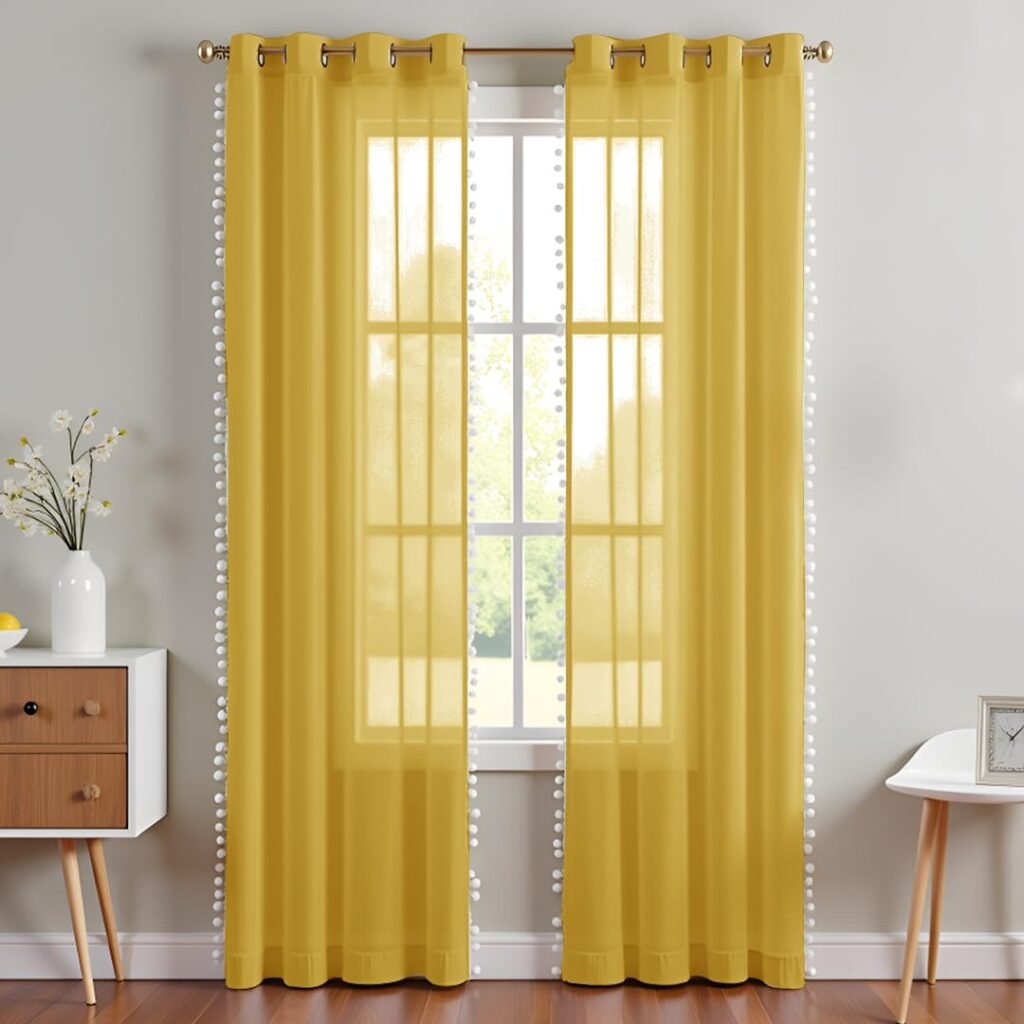
Mustard yellow and ochre curtains are not for the timid — but for those willing to commit, they create living rooms with a warmth and personality that more subdued colours simply cannot match. Yellow is the hue that is most commonly linked with happiness and vitality. Besides, the golden-toned shades of it even brighten up a room with a bit of sunshine regardless of the weather outside.
They are particularly suitable for the rooms that already have a lot of natural lighting – the color enhances the brightness that is already there rather than making up for a lack of it. In darker rooms, mustard can start to feel heavy. In bright rooms, particularly those that face south or west and get good afternoon light, mustard or ochre curtains are genuinely transformative.
What walls does mustard work with?
- White walls — the yellow pops clearly and the combination is modern and energetic
- Charcoal grey walls — a high-contrast combination that looks deliberately designed and very confident
- Warm terracotta walls — maximalist and earthy. Needs a confident hand but looks spectacular
- Deep navy walls — one of those colour combinations that should not work but absolutely does. The complementary relationship between yellow and blue creates a dynamic, interesting room.
⚠ WATCH OUT: Definitely avoid mustard or yellow curtains in rooms that already have a lot of orange or red tones – the combination can be quite overpowering. Mustard is great for making a contrast to cooler or more neutral environments.
How to Choose Curtain Colour Based on Your Wall Colour
If you are planning to pick the walls first and then the curtains, here are some handy combos that never go wrong:
Grey walls — what curtain colour works?
Warm grey walls: forest green, dusty pink, terracotta, warm cream, navy. Warmth in the grey enables warm curtain colours to link up naturally. Avoid cold blue-greys paired with equally cold curtain colours as this will make the room feel uncomfortably cold to an extreme degree.
Cool grey walls: navy, charcoal, white, sage green. stick to a cool-but-sophisticated colour scheme instead of going warm with colours that will clash against your walls.
White walls — what curtain colour works?
Almost anything — white is definitely the most forgiving wall color to go with curtains. You can get away wearing forest green, navy blue, terracotta, dusty pink, mustard, charcoal, sage, neutral linen — all of which beautifully contrast with white. Your curtain will become the main source of color in the room, so go for the one you really love.
Cream and warm white walls — what curtain colour works?
Warm wall colours work best: forest green, terracotta, dusty pink, warm cream (tonal), navy, sage green. Don’t go for very cool curtain colours if you have cream walls — the warm walls and cool curtains colours will be on each other quite tightly and it will be quite difficult to find a solution to this discomfort.
Beige and warm neutral walls — what curtain colour works?
That is the point when tonal, warm curtain colours really come to light. A darker, more opulent shade of the wall colour — warm brown, caramel, deep cream — makes for a perfect tonal living room.
Forest green, terracotta, dusty pink, and warm mustard are good choices as well. Stay away from sharp contrasts, except the room is very spacious.
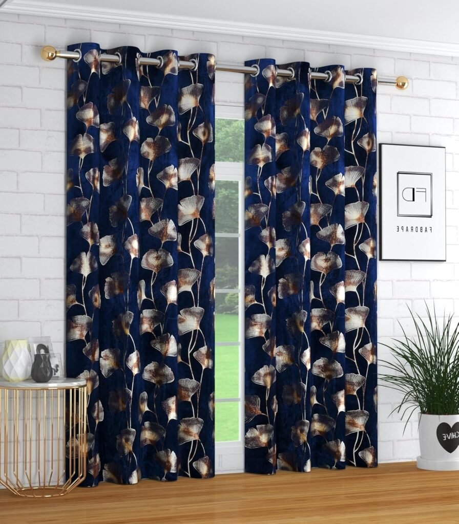
What About Patterned Curtains?

Patterned curtains — whether stripes, florals, geometric, abstract — are an entirely reasonable option in living rooms, but they have one critical condition: if the curtains are pattern, then the majority of other elements in the room should be plain. Pattern at window scale is so visually heavy that mixing it with a patterned sofa or bold wallpaper will, in most cases, result in a room that seems chaotic and cluttered.
The watertight strategy for patterned curtains is selecting a design that features one of the solid colours found elsewhere in the room. A curtain featuring navy and cream stripes in the room with a plain navy sofa and cream walls will bring about a nice harmonious effect. On the other hand, a totally different pattern in an already very busy room will create competition.
For Pinterest performance, patterned curtains in living room settings do extremely well — they are visually interesting and distinctive, which drives saves and shares more effectively than plain curtains.
Curtain Colour Mistakes to Avoid
These are the most common curtain colour errors in living rooms — all avoidable:
- Matching the curtain colour exactly to the wall colour — this is the sure way to make the curtains disappear and also give the impression that the room has no windows. Always go for a curtain which is either a shade darker, a shade lighter, or in a different hue than the
- Going for the colour that looks good on screen but fails to be the right colour in your room — monitor colours are never quite true. Always schedule sample fabric orders and check them in the room where you’ll be using them, including viewing them in both natural and artificial light.
- Ignoring the floor — The curtain color needs to complement the floor as well as the walls. Dark drapes in a room with very dark floors may give the feeling of the room being weighted down at the bottom. On the contrary, light drapes in a room with very light floors may come across as pale and
- Going too safe when the room can handle more — neutral curtains are not always the right answer. A room that is already quite plain in walls and furniture can take a strong curtain colour beautifully, and it will be much more interesting to live in.
- Choosing curtain fabric before choosing colour — the colour should come first, then the fabric. Deciding to buy velvet and then choosing the colour limits your options unnecessarily.
Final Thoughts
Choosing a curtain color is somewhat a dilemma of the mind. In fact, curtains can be easily changed differently from painting walls or changing floors. But curtains are also big enough for a nice choice means enjoying a beautiful thing every day, and a careless one means a mistake noticed everytime someone comes in your room.
The colours that will be most popular in the living room in 2026 are all based around one simple concept: warmth. So, if you want to be daring with terracotta and rust, elegant with forest green and navy, or simply assured with warm cream and linen — it is the warmly toned colours which are the main feature of those rooms that are most comfortable to be in at the moment.
Once you have narrowed down your colour, the next decision is fabric. The same colour in velvet versus linen versus cotton creates very different moods — and understanding those differences will help you get not just the right colour but the complete look you are after.
Frequently Asked Questions
Q: What is the most popular curtain colour for living rooms in 2026?
A: Forest green is consistently the most popular curtain colour in living rooms in 2026, appearing in both velvet and linen forms across a wide range of interior styles. Navy blue remains a close second — it is enduringly versatile and works in virtually every living room. Earthy tones like terracotta and warm rust are the strongest trend of the moment, particularly in rooms with warm-toned walls and natural material furniture.
Q: Should living room curtains match the sofa or the walls?
A: Neither — at least not exactly. Exactly matching curtains and a sofa may give off the vibe of a furniture catalogue, which is often thought of as old-fashioned. On the other hand, curtains that perfectly match the walls become invisible. The most effective way is to get curtains that work well with both: they should have some commonality — warmth, tone, or color without precisely imitating either the walls or the main furniture pieces. The 60-30-10 rule that was discussed earlier in this guide is a good point of reference for this.
Q: Are grey curtains too plain for a living room?
A: Grey curtains alone might seem quite dull, but a warm charcoal grey or a grey that clearly has a warm undertone is a completely different thing. Most people get it wrong by picking a mid-grey that has no definite character — neither warm or cool, neither light or dark. Go all out one side of the spectrum: either the warm, a bit brownish grey that goes well with the other warm elements, or the cool, almost black charcoal that is clearly a bold statement.
Q: Do dark curtains make a living room look smaller?
A: Dark curtains can give a room a cozier, more secluded vibe, which is generally a good thing in a large space. In a small space, however, very dark curtains that are also very thick might give the impression of heaviness. In small spaces, it is better to go for dark curtains that reach the floor and are installed very close to the ceiling – it is the vertical line of the curtain more than its colour that makes a room look bigger or smaller.
Q: What colour curtains go with cream walls?
A: Cream wall paint can really change things up since it gives warmth to them. Forest green, navy, dusty pink, terracotta, sage green, warm charcoal, and warm natural linen are some of the colors that go well with cream. Also, avoid using very bright white curtains because they would contrast noticeably with the warm feeling of cream and on the other hand, don’t use cold colors like cool steel blue or icy lavender because these colors are against the warmth of the wall.
Q: Can I use two different curtain colours in one living room?
A: In general, it is better to maintain consistency across all curtained windows in a single room — different colours on different windows can feel disjointed. The exception is when different windows have very different purposes or positions in the room, and when the two curtain colours are clearly related. For example, forest green on the main window and sage green on a smaller side window — tonal variation rather than completely different colours.

