The wall colour of your living room decides significantly your other furnishing choices, the colours of your curtains and accessories, the lighting qualities, and of course, the mood of the room at various times of the day. If you choose a colour scheme that is right, the room will look well-knit, well-thought-out and really a happy place to live in. But if you make a mistake, then even the most exquisite furniture and the best accessories will not be able to cover the fundamental problem.
The challenge with color is that it depends so much on context. For example, a color that looks warm and classy in a n UK living room facing the north might get completely washed out and pale under the bright sun in an Australian sun-room. Likewise, a combination that conveys luxury in a big formal space may be quite heavy and depressing in a small flat. The ideal combination for a room with warm wood floors and natural oak furniture is entirely different from the ideal combination for a room with dark floors and cool contemporary furniture.
This guide presents eight colour combinations that work consistently across a range of room types and orientations — with specific guidance on how to adapt each one to your particular room and lighting conditions, and with curtain and accessory recommendations for each that complete the scheme.
Combination 1: Warm White Walls with Natural Linen and Warm Oak
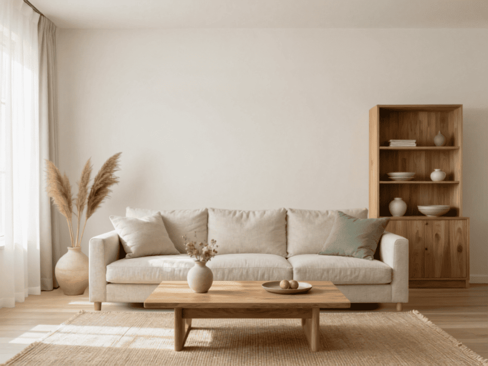
This is the most enduringly popular and most universally successful living room colour combination. Warm white walls — not brilliant white or cool grey-white, but a white with warmth in its undertone: cream, ivory, or a white with the faintest suggestion of yellow — provide a clean, versatile backdrop that works with virtually every furniture colour and every floor material.
Warmth is created by the materials and textiles used alongside the warm white: natural linen curtains, warm oak or light walnut furniture, jute or natural fibre rugs, and cushions and throws in cream, oatmeal, and warm stone colors, white and neutral curtain choices.
This pairing mainly governs Scandinavian and Japandi style interiors for a good reason: it’s the most dependable combination for living. It doesn’t get boring or old-fashioned rapidly, and it makes an excellent neutral background for personal items, plants, and artwork to bring out individual character.
- Wall colour: warm white (Benjamin Moore White Dove, Farrow & Ball Pointing, Dulux Magnolia White)
- Curtain colour: natural undyed linen or warm white — floor length, hung ceiling high
- Accent colours: warm stone, oatmeal, pale sage, dusty blush — any of these work as cushion and throw colours against this base
- Floor: natural oak, warm pine, pale blonde wood — this combination works best with warm-toned floors
Combination 2: Warm Terracotta Walls with Cream and Natural Wood
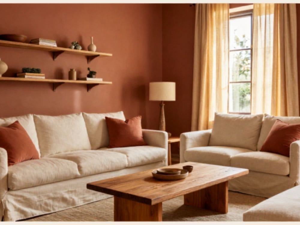
Over the past three years, terracotta has been one of the main interior colors and it is expected to remain popular in 2026 as well. The appeal is obvious: terracotta is warm, grounded, and deeply human in a way that more manufactured colours are not. It references clay, earth, and the sun-baked walls of Mediterranean buildings — a visual vocabulary of warmth and solidity that feels genuinely comforting in a domestic space.
The key to making terracotta work in a living room is pairing it correctly. Cream and natural white soften and balance the earthy intensity of the wall colour. Natural wood — warm oak, light walnut, or raw pine — grounds it. Linen curtains for a terracotta living room, linen curtains in natural or warm white complete it. This leads to having a room that looks and feels warm and inviting at the same time, not overdone or heavy.
Terracotta tiles can be a perfect element in both light and dark interiors, and here’s why: in a brightly-lit, sun-facing room, they possess that warm, sun-kissed Italian feel. Meanwhile, in a shaded, or light-deprived room, they extend their warmth to offset the lack of direct sunlight, something that cool colors can hardly achieve.
- Wall colour: terracotta, burnt sienna, warm rust, or Indian red — any warm earth-red tone
- Curtain colour: warm cream, natural linen, or warm white — this combination looks especially beautiful with linen curtains hung floor to ceiling
- Accent colours: cream, oatmeal, warm ochre, deep forest green (as a secondary accent)
- Avoid: cool grey, blue-white, chrome accessories — all read as cold and clash with the warmth of terracotta
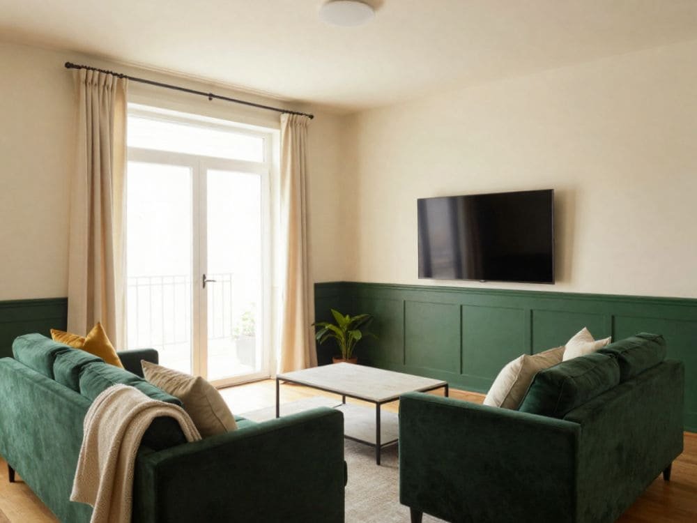
Combination 3: Forest Green Walls with Cream, Brass, and Natural Linen
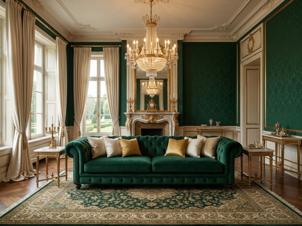
Forest green walls are the boldest recommendation in this guide and the one most likely to be transformative rather than merely pleasing. Deep, rich forest green — not the muted sage that appears everywhere, but a proper deep green — creates a living room that feels genuinely designed, genuinely striking, and completely unlike the neutral-on-neutral rooms that dominate most home styling.
This mix is effective as forest green is perhaps the most lenient of dark colours in rooms. It feels warm, not cold at all (in contrast to navy or charcoal), and at the same time it is a symbol of natural organic growth (making it feel living rather than heavy). And besides, it matches wonderfully a great diversity of complementary colours and materials.
Against forest green walls: cream or warm white sofa and ceiling, natural linen curtains or deep velvet curtains for a forest green living room or a complementary deep tone, warm brass or gold metal accessories, warm oak or dark walnut furniture, jute or wool rugs in natural tones. The outcome is a space that looks stunning in pictures and is superbly pleasant to spend time in.
- Wall colour: forest green, deep sage, hunter green, Farrow & Ball Calke Green or Studio Green, Dulux Jungle Green
- Curtain colour: For a relaxed natural contrast you can use natural linen; thick navy or plum velvet for a monochromatic drama; warm cream for maximum contrast
- Accent colours: cream, warm brass, natural wood, cognac leather, deep rust
- Best in: Rooms with warm-toned wooden floors and great natural light. These amaze in north-facing rooms but again the ceiling has to be white otherwise the room feels closed
✦ PRO TIP: If forest green feels too bold for your whole room, try it on the chimney breast or the wall behind the sofa only. A single forest green accent wall against warm white on the other three walls gives you the richness and drama of the colour without the full commitment — and it is much easier to reverse if you change your mind.
Combination 4: Warm Greige Walls with Deep Navy Accents
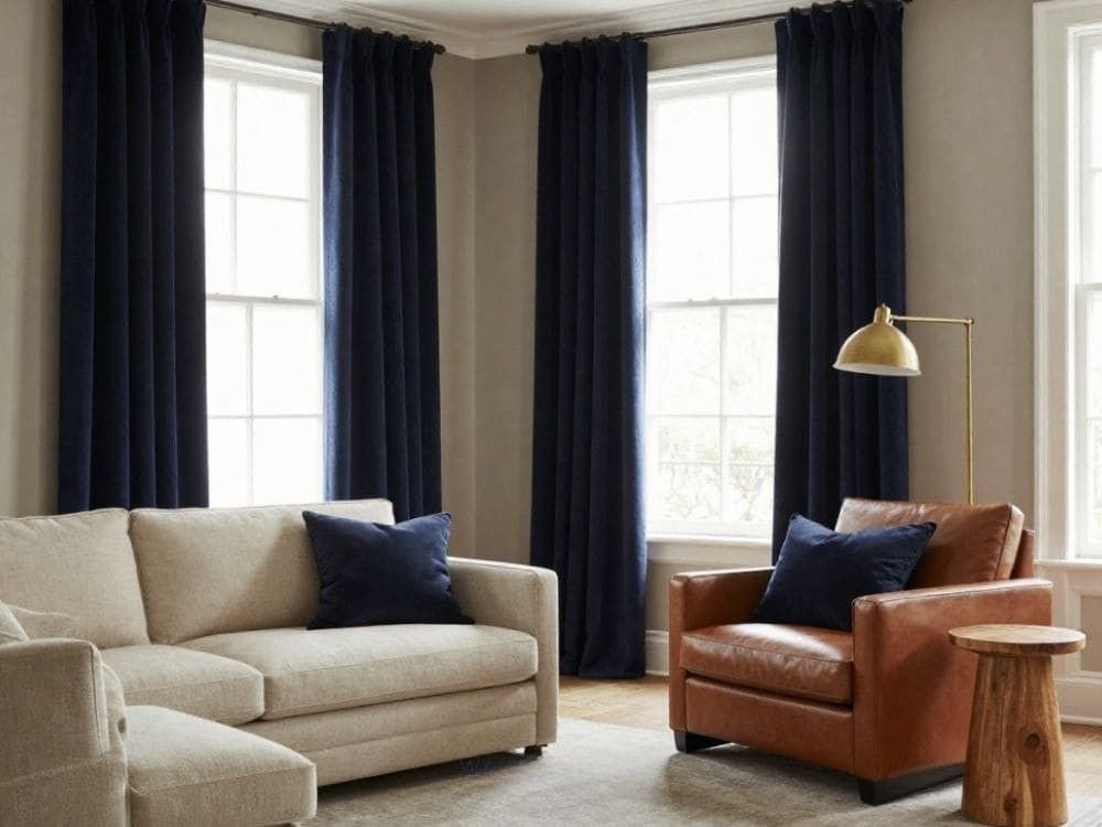
Greige — the warm middle ground between grey and beige — is the most commercially popular living room wall colour of the decade for good reason. It is genuinely neutral while remaining warm. It adapts to different furniture colours and floor materials without competing. It reads as sophisticated without being demanding.
Used alone, greige walls create a room that is pleasant but can feel slightly undefined. The combination that elevates greige from pleasant to genuinely designed is a deep navy accent colour introduced through curtains, cushions, or a single piece of furniture. Navy and warm greige have a relationship that is sophisticated and calming simultaneously — the navy provides depth and definition; the greige provides warmth and openness.
This combination can be used in almost every type of room: from north-facing to south-facing, tiny to large, traditional or modern. Most of interior designers who are professionals go for this combination when a client doesn’t want to take big color risks but still requires the room to look well-coordinated.
- Wall colour: warm greige (Farrow & Ball Elephant’s Breath, Dulux Egyptian Cotton, Benjamin Moore Revere Pewter)
- Curtain colour: deep navy — the strongest design move. Or warm cream for a softer approach.
- Accent colours: navy, warm white, brass, natural wood, cognac
- Best in: any room, any orientation, any style — the most universally safe premium combination
Combination 5: Dusty Blue Walls with Warm White and Natural Textures
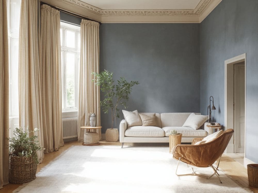
Dusty, muted blue — not the sharp bright blue of a primary colour palette, but a blue with a good measure of grey or green in it: air force blue, slate blue, dusty denim, faded indigo — creates one of the most calming and sophisticated living room atmospheres available. The colour references sky, sea, and open space without the coldness that purer blues can have in an interior.
The look of the coldness or clinicality that might come with this combination is completely avoided by the materials that go with it: warm white ceiling and trim (not cool white), natural linen or warm ivory curtains, natural wood furniture, jute or wool rugs, and cushions in warm stone and cream. The blue that has been softened with gray is the mood setter; the warm natural materials are the comfort providers.
This combination is particularly effective in rooms that receive direct sunlight for part of the day — the natural light brings the dusty blue to life and gives it a depth and interest that it lacks in very dark rooms.
- Wall colour: dusty blue, air force blue, slate blue, Farrow & Ball Borrowed Light or Parma Gray, Dulux Denim Drift
- Curtain colour: warm ivory or natural linen — the warmth of natural linen against dusty blue is one of the most naturally beautiful colour pairings in interiors
- Accent colours: warm white, warm stone, natural wood, cognac, soft sage
- Avoid: cool white and grey accessories — they make the combination feel cold rather than calm
Combination 6: Warm Stone Walls with Warm White and Velvet Jewel Tones
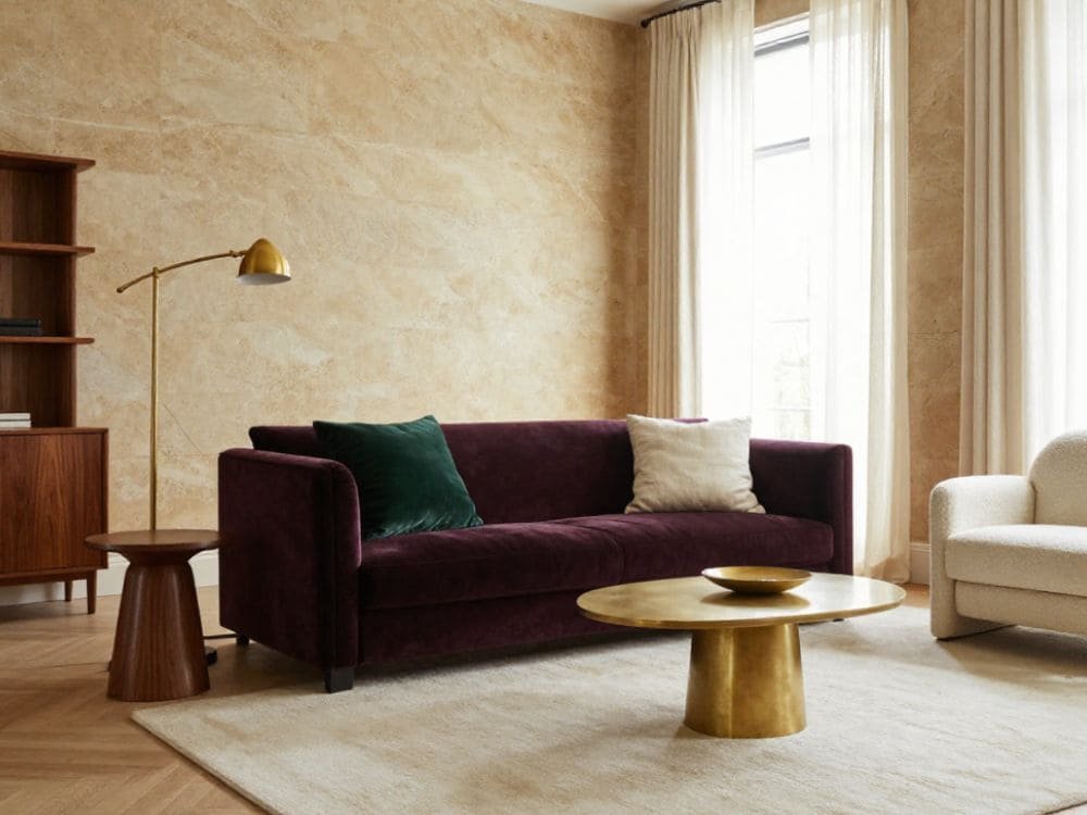
Warm stone — the colour of natural limestone, travertine, or pale sandstone — is a quieter, softer alternative to white that creates a living room atmosphere of subtle luxury. It is warmer than white, less dominant than terracotta, and more sophisticated than standard beige. The best warm stone wall colours have a very slight warmth in their undertone — the faintest suggestion of pink, ochre, or honey — that reads as natural rather than manufactured.
Warm stone walls achieve the level of extraordinary versus just nice, when a single velvet jewel tone is added as an accent: e.g. a deep plum velvet sofa, forest green velvet curtains, or rich teal velvet armchair, navy velvet cushions. The interplay of the soft warmth of the stone against the luxurious velvet creates a really deep and interesting room visually.
- Wall colour: warm stone, pale limestone, warm greige, Farrow & Ball Setting Plaster or Dead Salmon
- Curtain colour: velvet in a jewel tone — deep plum, forest green, dusty teal — OR natural linen for a softer approach
- Accent colours: velvet jewel tones, warm brass, cream, dark walnut
Combination 7: Two-Tone — Deep Lower Walls with Light Upper Walls
Two-tone wall treatments — where the lower portion of the wall is painted a deeper colour and the upper portion and ceiling in a lighter complementary tone, with a painted or physical dividing line (a dado rail, a painted shadow gap, or a simple straight edge) — are one of the most effective ways to introduce colour drama into a living room without the full commitment of painting all four walls in a dark tone.
The most successful two-tone combinations are those where the upper colour is a lightened version or a natural companion of the lower colour: deep sage lower with pale sage upper, forest green lower with warm cream upper, deep navy lower with air force blue upper, terracotta lower with warm white upper. The dividing line is typically positioned at approximately door-handle height (90 to 100cm from the floor) or at dado rail height in period properties.
Doing this has the benefit of giving the area downstairs, that is, near the furniture where the eye naturally rests a lot, a big visual presence and a really rich feel. Meanwhile, the walls up high and the ceiling remain pretty light, so the whole place won’t give you a closed-in feeling.
- Best two-tone pairings: deep sage lower + pale sage upper | forest green lower + warm cream upper | terracotta lower + warm white upper | charcoal lower + light greige upper
- Dividing line height: 90–100cm from the floor for standard rooms; 110–120cm for rooms with high ceilings
Combination 8: Charcoal or Near-Black Walls for Maximum Drama
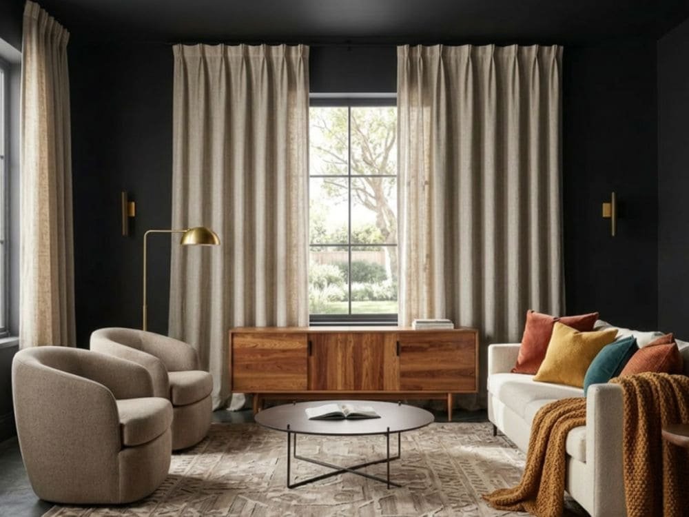
Not everyone’s cup of tea are walls in deep charcoal or almost black in shades in a living room. But in fact those who this kind of wall will go perfectly for get an incomparable effect. A living room colored with charcoal or deep graphite walls, really white ceiling and background, and a few carefully warm accessories selected will make the atmosphere both dramatic and intimate, sophisticated yet cozy.
The key to making very dark walls work in a living room is warmth in the supporting elements. A white sofa. Warm brass or gold metal accents. Furniture made of natural wood which color is between light and medium. Curtain at the ceiling height, white or cream color, and very wide to have the maximum contrast effect with the dark walls. A big warm colored rug used for the seating area. The darkness becomes the room’s drama; the white and warm accents provide the livability.
This combination is perfect for spaces which gets a sufficient amount of sunlight throughout the day (which will brighten up the dark walls instead of them sinking into the shadows) and also for the rooms that are mainly occupied during the night times when the artificial lights set the scene for the dramatic, gallery-like mood that dark walls excel at.
- Wall colour: deep charcoal, near-black (Farrow & Ball Railings or Off-Black, Little Greene Paean Black, Dulux Celestial)
- Curtain colour: white, warm cream, or ivory — the high contrast of white curtains against near-black walls is extremely striking
- Accent colours: warm white, warm brass, natural wood, cognac, deep rust for a warmer palette
- Avoid in: rooms with no natural light or very small rooms with low ceilings — the darkness needs light and height to breathe
How to Choose the Right Combination for Your Room
The correct combination for your specific living room depends on four variables that no guide can assess for you:
- Direction and quality of natural light: Rooms facing north require wall colours with warm undertones while those facing south can go for cooler ones. Rooms with not so much natural light get the most out of warm, light and reflective colours while those with lots of light can throw supporting darker, richer
- Floor colour and material: Choose warm wall colors to go with living wood floors (oak, pine, walnut). Floors of concrete or grey tones are more suitable for cooler
- Furniture colours you already own: There are different types of sofa available, the same should be considered before finalising the design. In case, your sofa is cream or warm white you can almost use any wall colour. If your sofa is grey then warmer wall colours for example terracotta, sage work better with it than more grey. In case, your sofa is dark lighter walls provide the right
- How you want the room to feel: You can go for a warm, enclosed feeling with terracotta, forest green and charcoal or choose light and open with warm white, dusty blue and warm greige. One is not better than the other – it really depends on how you intend to put the room to use and what mood you want to
✦ PRO TIP: Before committing to any combination, buy test pots of the wall colour and paint at least 30x30cm patches on each wall, including the darkest corner. Observe the patches at different times of day — morning, noon, and evening with artificial light. Most colour decisions that go wrong were made from small chip samples viewed only in daylight in the paint shop.
The Role of Curtains in a Colour Combination
Curtains cover a significant proportion of the wall surface when drawn and are visible even when open as the fabric panels at each side of the window. They are part of the room’s colour combination whether you treat them as such or not — so treating them deliberately is always the better approach.
Two strategies work well for incorporating curtains into a living room colour combination:
- Strategy 1 — neutral curtains that recede: choose curtains in warm white, cream, or natural linen. They do not compete with the wall colour and ensure the colour combination reads primarily through walls and accessories. This is the safer, more versatile approach.
- Strategy 2 — Curtains as the main colour statement: Pick curtains a shade or two darker or richer in colour than the walls. A nice example is a warm neutral wall paired with deep velvet in a jewel colour. In this case, the curtains are the main colour statement and the walls act as the background. This style results in greater visual drama but definitely takes more
Final Thoughts
Deciding on a living room colour combination is among the most important and longest lasting decorating choices you’ll make. If done properly, the perfect combination can give you a room that reflects your personality – consistent, inviting, and exactly designed for your lifestyle.
These eight color combinations in the guide show a whole spectrum of possible styles, starting from the calmest and most generally foolproof (warm white with natural elements) to the most self-assured and striking (is near black walls with white and brass?). None of them is incorrect in fact, any one of these could be successful in the right space, with the right lighting and the right accompanying features.
Your most important principle is that you should experiment with the exact combination that you have selected at full scale in your real room before you decide to go ahead with it. A color that seems flawless on a chip of paint, on a display, or in another person’s house may appear totally different in your particular room with your particular lighting. Put a test patch that is at least 30x30cm of your chosen color and watch it for the whole day before buying the tins.
Frequently Asked Questions
Q: What is the most popular living room wall colour in 2026?
A: The top most searched living room wall colour trends in 2026 are these beautiful warm earthy tones, mainly terracotta, warm rust, and deep burnt orange, together with a refreshed focus on the dark greens of the forest and the durable popularity of warm neutral hues like warm white, greige, and warm stone. Cool greys, which were very fashionable for most of the last decade, have been pretty much taken over by the warmer, more natural coloured moods in the design world. Those who want a wall that really makes a statement in terms of design are now increasingly going for a dark, moody colour like charcoal, midnight navy, or forest green.
Q: Can I use two different colours on living room walls?
A: Yes — two-tone wall treatments, where different colors are applied to different sections of the walls or to different walls, can be really effective if the right color combinations are chosen. The major winning strategies are a dark lower wall with a light upper wall and ceiling, a deep colored accent wall with the other three walls remaining neutral, or ‘colour drenching’ where walls, ceiling, and trim are all in the same or very closely related tones. What rarely works is two contrasting colours on adjacent walls of the same room without a clear design logic connecting them.
Q: What colour should living room curtains be?
A: Curtains should either complement or contrast the wall colour intentionally. The most versatile approach is warm white, cream, or natural linen curtains — these work with virtually every wall colour combination and recede from the room’s colour scheme to let the walls and furniture carry the visual weight. For a bolder approach, choose curtains in a tone that is deeper than the wall colour: deep green curtains against warm greige walls, navy against warm grey, plum against warm stone. Avoid curtains that are exactly the same colour as the walls — they visually disappear and reduce the sense of framing at the window.
Q: Does forest green work in a small living room?
A: Yes, forest green can provide a stunning effect in a tiny living room; however, the method is essential. Dark forest green covering all four walls of a really tiny room with very little natural light might be imprisoning. The best way to treat a small room is to apply forest green only on the chimney breast or the accent wall, while the rest of the walls can be painted in warm cream or warm white. By doing so, you get the colour’s depth and the impact while still making the room look spacious. A tiny forest green accent wall along with ceiling-high linen curtains in natural or cream is not only a combination that makes the room appear stylish and personal but also a room that does not seem dark or oppressive.
Q: How do I choose between warm and cool colours for a living room?
A: The direction your room faces is probably the most reliable indication. North-facing rooms get indirect, cooler light while warm wall colours work best to counteract the coldness of the light.South-facing rooms get warm, direct light and so can have both warm and cool colours used in combination.East-facing rooms get warm morning light and cool afternoon light.West-facing rooms are the warmest in the evening.In addition to orientation, if you want your room to feel cozy and enclosed, choose warm colours (terracotta, sage, warm greige, warm white). If you want your room to feel airy and fresh, choose cool or light colours (dusty blue, cool greige, warm white).